Initial Research - What the books are about - 18.10.22
For this section, I will be looking at what the books are about and look into the authors and who they are as well. This is so that I can get a full grasp as to what each book is about and get a better idea as to what to illustrate or photograph on the cover of the book. The books are listed below;
Edwards, A. (2021)
A Clockwork Orange - Anthony Burgees
The Clockwork Orange is set in dystopian England where we get the first-person view of what a juvenile who is not being treated right in the new political system. He also is going through rehab for his behaviour to Summarise the plot of the book, the progtagonist who's name is Alex, is a guy that likes to do a lot of bad things such as rape and senseless kiling. But after being put in jail for crimes that he and fellow delinguinst have done, he undergoes tratement to basically take his freedome of freewill away and thus then turns into someone that cannot do any harm to anyone else, even if they try and hurt him. After being hospitalised, the procedure that takes his free will away was undone and once returns into someone that is very violent.
A Clockwork Orange (novel) (2022) Wikipedia
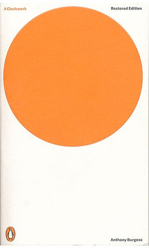
The book cover shown is the minimalistic approach that Jonathan Barnbrook took when he designed the book cover. Compared to the original bookcover from the 1960s, it is unassuming, yet it differs a lot, which I like in itself as the book is something controversial. It lacks the sinister feeling that I would think if someone would describe what the book is about to me.
I feel like this book would be best for young adult, as the plot of the book sounds dark.
The Curious Case of The Dog In the Night-Time - Mark Haddon
This video quickly summarises the plot of the whole book. I think that instead of letting me put it into words, the video will summarise it faster and with much more detail than I can. The video was found on YouTube and was also shared on the Padlet workspace so that people can add it to their research pages.
The Curious Incident of the Dog in the Nighttime by Mark Haddon (Book Summary) - Minute Book Report (2015)
Christopher is said to have some mental health disorders in the book and after some research, I have found that he has Asperger's Syndrome, which is a type of Autism and consists of not being able to interpret other people's feelings within a given situation. In the book, this leads to him ignoring people's request to not delve deeper into the murder of the Neighbour's dog and with the police trying to take him back to his father, even though he successfully gets on a train to his mum in London.
The curious incident of the dog in the night-time (2022) Wikipedia
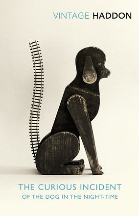
The book cover shown is the 15th Anniversary of the book. I had not been able to locate the illustrator for this version of the book through online resources. This version of the book is a very interesting illustration as this cover shows both the dog and the train tracks that lead him to find his mum in London. He does this by using the train to get from Swindon to London. I also like the simplicity of the book cover (such as the Clockwork Orange book cover) as this book is already a classic in some people's eyes. Also tamed with the rustic look of the dog and the use of what looks like toys (like the toy train tracks and the toy dog) to represent the toys that a special needs school might have when kids with special needs might need them.
I feel like this would be best for a young person (between young teens to young adult) as some of the story might be difficult for someone that does not know what mental issues that the protagonist has in the story.
The Curious Incident of the Dog in the Night-time Book (2022) Penguin Books
Just My Type - Simon Garfield
To quickly summarise the book, it is a take on what different typefaces are when put into comedic situations, such as dating another type of typeface with each other or just what the different types would do in different days of the week. The book cover is shown below.

The book cover shows the many different typefaces that anyone in the world can use. For this though, it could be like tinder where you pick and choose the type of font that you would like to date or would prefer to use on a day-by-day basis. Just my type could also be a play on words such as saying you're just my type to a person that you're interested in. I also like the way that the book cover is something bright, to encourage others to pick it up and maybe buy it just because of the way that the book cover is shown.
I feel like this book would be good for a fiction sort of take on non-fictional things such as type. This would also be good for people that want something to laugh at and could be portrayed in the book cover.
Just my type (book) (2022) Wikipedia
I think that for this project, the Curious Case of the Dog in the Night-Time will be an interesting book to do as I feel like I can relate to the protagonist, Christopher, a little bit just because I have also experienced and still experiencing some mental health issues, as well as being curious as to what I can create with such an interesting storyline and characters. I also think that my style of illustration fits well with the book cover design.
I also think that designing a young adult's book would be a nice thing to design.
Initial Research - Existing Book Covers - 18.10.22
I thought that it would be a good idea (whilst doing Unit 11) to go into a popular bookstore and browse other graphic designers' book covers. I also managed to take photos to talk about what I like and what I don't like about the works of others.
General Photo of the Young Reader's Book Shelf
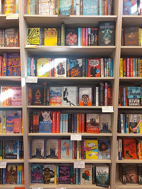
Here is a general photo of the whole bookshelf. As you can see, the colour palette differs from what book represents what and it goes from the black and white photography of the "13 Reasons Why" book (as this book represents suicide and is darker in tone) to "Destination Anywhere" (which looks to be a brighter tone with the book cover's use of colour and illustration). For young readers, the range of illustrations is massive, as there are a lot of genres of books that are on display.
Looking at Design Specific Books
Whilst having a browse in the bookstore, I also looked at how design-specific books look compared to the different books that young readers read. Two of the books stood out to me and interested me. One of them is Japanese Interiors and the other one is Design Classics.
The Japanese interiors book shows the design language of japanese paper doors, which is a nice touch to have. The book is also embossed with the wooden frame raised whislst the paper from the doors is recessed to give this sense of depth when looking at the cover of the book.


The design lanugage of the other book looks the same as the Japanese Interiors, but with more enpahsis on the designs that it brings to the reader. The muticoulored designs are the designs that the book will talk about. It is nice to try and make sure that we can understand the design language of different books to be able to tell what audience the author of the book is trying to convey through the use of the cover.
The Designs of Young Readers' Books
Seeing that I have to design something for young readers due to the book "the Curious Case of the Dog in the Night-Time" being aimed at younger readers (but adults can still read it), these are the types of books that I need to talk about and point out what I like and dislike about the design. Through looking at the cover first hand and on the bookshelf of the store, these are the designs that stood out to me when looking at the covers.
Thirteen Reasons Why - Jay Asher


The book cover is silver with a photo of a girl on the swing. The book title also has the number with the red 13 in it. The spine of the book also has a red play button on the bottom, with the penguin logo at the bottom of the spine too which has been desaturated in colour to not make it stand out from the spine of the book. The back of the book has red accents for the play, stop and rewind button.
I feel like the book cover shows a very serious tone to this, with the red accents maybe signifying danger. Luckily I have read the book and the design shows the dark tone very well in the design.
I like this book cover just because it shows a subtile dark tone, but with also a professional look to it. I also do not like the cover too much, as it only shows a girl on the cover, nothing else is found interesting. This can also be because the book does talk about dark subjects and cannot be shown as bright and colourful due to this sense.
To improve this, maybe adding in a tape player and some blood to intrigue the potential reader to pick up the book and to bring the reader in. Or maybe have everything be black and white, with the base of the cover silver, but still have the tape player and some blood on the cover. These are just some of the ideas that I have with this book cover.
Orphan Monster Spy - Matt Killeen


The cover is an Art Deco-style design, which could represent the era that the book is set in. The gold accents, with the black background, show a mature and expensive look.
Reading the blurb now gives the book this sort of spy crisis style that is set when the Nazis are around. I like the design, just because it stood out from the rest of the bookshelf with the gold accents and black background and geometric shapes.
The First Thing About You - Chaz Hayden


This book cover caught my eye because of the way that the lettering on the book cover was negative space on the cover. The different coloured dots might be a little difficult for someone to differentiate the different colours, but the lettering will still be readable just because it is made up of different colours, so as long as someone is not able to see colours, people that are colour-blind can still read the lettering for the book cover.
The back cover also shows a person in a wheelchair. This is a nice touch as the front cover talks about a classic boy in a wheelchair love story.
Red Wolf - Rachel Vincent


This book cover also caught my eye because of the way that the space inside the main character. The woods that little red riding hood is shown through illustration. The red really does stand out on the greyscale gradient background, which looks like it has been hand-painted. Little red riding hood also looks like it is hand drawn. The way that the cover is composed is also appealing to me just because I use this type of composition in my photos a lot. The spine of the book also shows little red riding hood's cloak, with the arrow being inverted from red to white when it reaches her cloak so that it is easier to see.
The back cover also shows a wolf amongst the trees with little red riding hood in the same composition as the log cabin in the front cover being a point of interest.
These are just some of the book covers that I really liked when looking at the young adult section of the bookstore. The rest of the photos that I took will be shown below, so that I can show you the current book covers in today's market.


