Final Logo Design - 17.01.23
For this logo, I had an artist friend talk me through what he thought would be good ideas to create the logo more coherent and mathematically correct as he thought that my previous logo was interesting, but not coherent enough to warrant it to be the final design.
I also agreed with his feedback and experimented with the logo a little bit and came up with this with his feedback;


For the first logo, I have dialled back the blurriness as I feel like it would be too much and would be too distracting for the logo design.
Me and my friend also talked about the way that it is mathematically created due to having measured out guidelines when working on this logo. I took this on board and tried laying out the logo so that everything was mathematically correct.
The photo below shows the guidelines used for this;
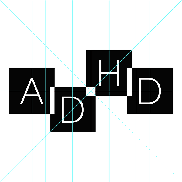
The logo layout was made using a 200mm x 200mm square, with each square being 50mm. I also created the perfect inverted square to be in the middle of the logo, with perfect rectangles for the logo as it is mathematically correct.
My friend told me to look up Riot games' logo redesign, as he told me that this would be an interesting logo to discuss within this design and how it relates to the feedback that he gave me;
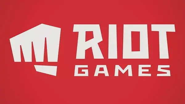
McCauley, J. (2019)
As you can see, the logo consists of being geometrically correct, with parallel lines and adjacent angles within the logo design. We also discussed the logo changes within Riot Games (and other companies for that matter) stepping away from the use of 3D and textures within logo design and coming up with flatter and consistent logos, which use geometric shapes and company values within the logo and graphics for the company.
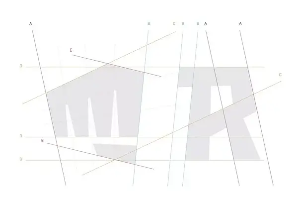
Within the Riot logo, there are lines that are labelled. These lines are to show that they are the same and are parallel to each other.