Brief Characteristics and Initial Research - 23.02.23
For this personal project set by Pearson, the theme for this brief was for the climate change crisis. The brief was also to create whatever suited the graphic designer, whether this can be a photography campaign, a set of posters that can describe an issue related to the climate crisis or even a small film talking about the climate crisis.
To help with the brief, the tutors gave us a workspace where we can discuss or add anything that is related to the project brief. The padlet is linked here.
Gavin Turk
Whilst looking at this, I was intrigued by the different art forms used and was particularly drawn to the work of Gavin Turk, where he would have literal piles of waste in the middle of the art room floor. This reminds me of when I would be the one taking photos of literal garbage found on the streets and photographing the waste found in the streets. The photos below show his work against mine;


My work is shown on the left, whilst Turk's is on the right (in colour). I took this photo back in December 2022, as I felt it was good to show how humans used the earth's resources and then just leave waste like this. I always feel like appreciating/photographing things like this can have a better impact through social media as I feel like showing things in a better light does not help at all.
Turk's work, on the other hand, is a full-cast bronze statue that is coloured and shaped like a bin bag. The description of the art piece talks about how the art "defines humans by what we throw away and conversely by what we choose to display in our hallowed museum halls" Turk, G. (no date). This, alongside the way that he describes that art piece translates very well with the way that humans glorify the way that sustainability and climate change is a real thing. We as individuals do not think that the things that we do, either with work or even having a simple lunch, can affect the planet. Even with Turk's work, at least the bronze can be smleted down and made into something else, whilst with my work, it was shot on film which can be more harmful that what Turk has done.
Being a Sustainable Graphic Designer
On the shared workspace, there was also an interesting post about being a sustainable Graphic Designer. This blog post, which is linked here, talks about how designs from a graphic designer can have (both physically and digitally) an impact on being sustainable. For example, the post talks about digital design having potentially less impact on the environment. But, this can also have effects such as higher carbon emissions due to website hosting and servers not running on biofuels and such. Physical Design can also be something that the designer can be sustainable, for example using recycled paper and using printing inks that can be washed with water etc. Hadjiosif, S. (2021)
I found this to be interesting to have a running topic throughout the design process and only use my laptop or using recycled paper or using only my digital camera (as the use of film is a one time use) to help me throughout the design process. I think that using my laptop for everything would be a great solution/challenge in this project or even trying to be sustainable throughout this project would be a great challenge also.
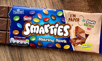
Sustainable Packaging
There is also a lot of sustainable packaging already on store shelves (even no packaging at all). Companies such as Nestle have already made sustainable packaging by using paper instead of single use plastic covers, Cadbury have gone and tried to get 100% sustainable cocoa beans and Mcdonalds are on their way to being Net Zero by 2050. Cristian, D. (2023)
But most of their products that I have seen do not try and go down the route of showing that on their graphic designs. Just a simple logo, colour/texture change and even just making the look of their packaging more appealing yet still have their own graphic tied to their logo/brand.
I understand as a Graphic Desginer that this is what makes their brands easily recognisable, but at the same time, I feel like it is mostly half-arsed and making it look more sustainable is always a great way forward.
Instead of fully focusing on looking like their own brand identity, maybe they could add more to their design, without changing the brand identity. It might be a tight thing to balance, but at the same time, it can be do-able and with something that can be so easily put onto packaging for a marketing ploy, this is something that can be put forward as an idea.