Picking and Choosing a Book and Initial Research - 13.10.22
For this part of the unit, we were tasked to try and choose a book that we would like to do a book cover for. To start this we needed to explore what each book was about, the target audience of the book, and the author of the book.
What the different types of books were about?
There were 3 books to choose from that were listed on the Penguin books website. These are outlined below as I needed to choose a book that I wanted to do a book cover for.
Girl, Woman, Other - Bernardine Evaristo

This book is Adult Fiction that is based on 12 very different characters that are based on women, black and British, which tells the stories of friends and families that span across the country and throughout the years. This book fuses fiction into different experiences of different people who are the same, who have the same gender orientation, skin colour, and nationality.
Newson, K. (2022)
The book cover shown was the winner of the penguin book 2022 contest.
What I like about this cover is that it shows analog techniques, which was hand-woven paper, interlaced together to create a striking cover. Paper to signify books or to also symbolically show how people think women are, even though this is not the case in this book. The weaving of the paper shows how interconnected each one of the stories is, as this is relating to how even though each experience is a different person, they still have things in common. The symbols shown are Adinkra Symbols that originate from the Akan people from Côte d'Ivoire and Ghana. These symbols were used in the 1980s and are still being used today. These symbols show symbolic provinces that relate to life, death, wisdom, and human behaviour.
Diary of a Young Naturalist - Dara McAnulty

This book is a non-fiction nature book. But this is not just a nature book, as the author had to overcome severe anxiety and has autism. He writes this book as if it is a literal diary that captures his emotions and what the is going through personally.
Newson, K. (2022)
The book cover shown was the winner of the 2022 Adult non-fiction.
I like this book cover as this is a simplistic approach to the book cover. The paintbrush is shown as the grass on the book cover. The book cover looks like it was created using traditional techniques, and then brought over to the digital side so that this book cover can be printed onto book covers. This type of book would suit me best as this would be the type of photography and illustrations that I can do, alongside being able to relate to the story a little bit with having mental health issues and how I can link to that in the book cover.
Murder Most Unlady Like - Robin Stevens

This is a 2014 children's mystery novel by Robin Stevens. The story follows 2 boarding school girls in 1930s England trying to solve their first murder mystery. The story itself is written in the style of a casebook.
Newson, K. (2022)
The book cover shown was the winner of the young reader's book of 2022.
The way that illustrations are mostly for children is shown very clearly on the book cover with the colours being very vibrant and the use of cartoonlike lines. The way that it mostly used illustrator with the different line weights and shading cements the idea of it looking more cartoony than a real-life drawing. This backs up the idea as this is a younger reader's work.
There was a slight mix-up on the brief, so these books are not the books on that we will be basing our research and development. The group work will have subheadings that are the books that we will pick and choose from. But this is still research that is still relevant due to them being last year's winners and book covers.
Collraborative Work - Intial Research for the 3 Chose Books- 13.10.22
For this part of the unit, we were tasked to research (as a team) the different heading shown in the Padlet workspace.
Seeing that to embed the code into our websites we have to pay for it, the link is shared instead, with some screenshots of the collaborative space;
What are Semiotics? - 13.10.22
Semiotics is the study of signs as elements to show communicative behaviour. It is also the analysis of this through language, gestures, or clothing. There are different parts that are analysed when into semiotics and these are;
Signs, Signifier, Signified, Icons, Symbols, Index, Syntagm, Paradigm, Denotation and Connotation.
This is talked about more in depth below.
Signs
This is when a signifier and a signified are shown and the person then recalls what it is in their mind. People do this every day with road signs and logos for companies as they can relate to the company and road signs quickly and with great effect. For example, the warning signs for the road can be seen as just basic shapes, but with the effect of learning, they can be linked.
Denotation
This is the action or process of trying to indicate or refer to something by means of words, symbols etc. Just anything to try and get the message across. For example, if the word cake is said, it is trying to denote something as I was trying to point out a cake. This can also be said true about a symbols. Warning signs are a great way to denote a warning such as crossroads as this is something that is really easy to denote and even be seen on the roads.
Connotation
This (in the simplest terms) is the complete opposite of denotation, as this is how a symbol or a word shows (somehow) more detail to the user. For example, the word dog shows a dog but this can be different breeds of dogs or how the dog can be shown as angry or barking at someone. It is also the same as symbols. An example is shown below;
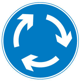
This (without context) can be shown as something going around. Could be showing how a machine rotates or which direction a merry-go-round will be travelling. But to a regular road user, they will immediately know that this is for a sign for a small roundabout and will know just by the symbolism of this.
We already do this to everyday logos, but to understand why, there are more things that need to be pointed at to be able to understand why we know such symbols already
There are two things that make up a good sign. The first part is the signifier and the second part is the signified. These are talked about below.
Signifier
A signifier is something physical that a person sees and can relate to when looking at it. This can be either an Icon, a Symbol, or an Index.

Icon
An Icon is something that can physically resemble the signified. An example of this is a mountain photo. This shows that it is a mountain in physical form and as a photo, which is something physical in the medium
My own photo of the swiss alps
Symbol
A symbol is something that has no context to it when a signified is not present. This means that without a signified or some information about the sign, it means that the signifier does not mean anything. A good example of this is a no-entry sign, as, without context, it is just a red circle with a white bar in the middle. This symbol could have been a blue background instead, but the blue does not signify any danger.


Index
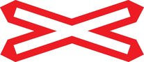
This is a signifier that represents the signified and it is learnt through the culture. For example, there are different road signs to indicate a rail road crossing here in the UK and in the USA. Another good example of this is time and numbers, as this is something learnt in schools and in different cultures.
Signified
A Signified is the interpretation of the signifier. This is where the idea of the connotation is shown. This is linked to the Paradigm and the syntagm, as this is what forms the basis of the signified.
Syntagm
A single word or element of design that can change the overall meaning if the word or the design is changed.
Paradigm
This is a group or related ideas that are interchangeable in a sentence or design, yet they still have the same collective meaning.
An example of both a Paradigm and a Syntagm is shown below;
A dog is sitting.
The paradigm part of the sentence is the collective sentence, which is shown in black, whilst the Syntagm is shown in red.
The Syntagm can be changed (for example, standing or eating) so that the meaning of the whole sentence can be changed. This can also be done with design, for example the cross the right way up shows Christianity, whilst the cross upside shows anti-christ or satanic symbol.

The cross inverted to show Satanic worship

The cross the right side up shows Christianity
Even though they are both using the same image file, a simple flip of the cross can send the wrong image. As designers, we have to be careful of this as some designs can come across as wrong and offend or even come off as insensitive if we do not design something carefully.