Custom Lettering and Font Testing - 17.11.22
For the lettering, I decided to try out a couple of things.
One of them was to try out what type of fonts would work for the awards lettering and for the author as well. I also decided that the best thing to do for the title was to do custom lettering for that, as I wanted something that looked hand drawn but still eligible. This was because the main protagonist was a young teenager and I felt like if I do certain things that make it look like someone younger has done it, then it could be portrayed that a kid will be the one writing it.
But before experimenting with this, the font testing for the author and awards were done first and are shown below;
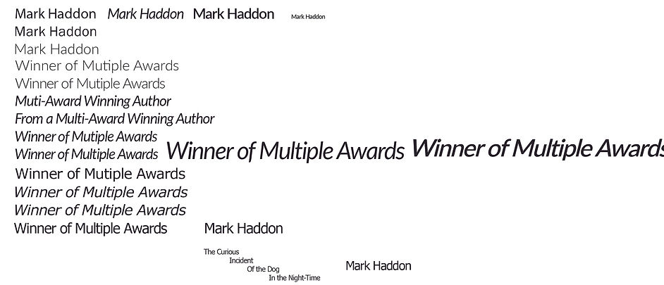
I decided to go for the font "Fato" as this provided a good balance between a clean but still professional font. This also had the ability to be changed to something light in weight and in italics as well. This font will be featured as a font for the author, awards, and the blurb as well.
I decided to choose a sans serif font instead as I felt like something had to balance with the custom handwritten style lettering. Choosing a serif font would make the book cover look too formal and out of balance with the handwritten font. And also looking at market research, some designers would have two fonts that balance each other quite well that also contrast with each other. They would also have a specific font just for anything that needs to be legible.
I would also try and design the custom lettering in conjunction with the author's typeface. This is so that I can experiment with making it look handwritten whilst having the ability to make it look eligible and design cohesive, both for the author's name, awards, blurb and the title of the book.
I had to make sure that it looks handwritten due to the main character of the book being a young teen that has autism and I think that showing the title as being handwritten would portray. The outcomes are shown here;


The first attempt was to use the blob tool in illustrator, as this would at least give me a good chance to make it look handwritten, due to using a graphics tablet (which meant that I can draw on digital paper) and how the tool is used (the blob tool uses the mouse cursor to create blobs that can be changed using the pen tool). This made the lettering look too messy for my liking and would not go well with the font used for everything else. The second image also shows how I would experiment with the dog lettering as this would be interesting to experiment with. I started to change the space in the letter d and settled on something that is close to the final letter in that image. I wanted to focus on that letter as I felt like "dog" would be the word that would stand out in the title.
After finalizing this letter, I would hop onto the pen tool for the lettering and would try the pen tool instead. I would try and create the letters only using one line which is shown in the later stages of the slideshow. Small changes were then made after being happy with the general layout of the custom lettering. Overall, the last design in the slideshow is the one that I am happy with and will be using in the later outcomes.